How to Make Athleisure Look Expensive, Not Sloppy
Quick Answer: Athleisure reads expensive when the fabric is thick and matte rather than thin and shiny, the fit skims rather than sags, one non-athletic piece is added (a tailored coat, a real bag, clean leather sneakers), and the palette stays to two or three coordinated neutrals. The difference is almost never price — it’s those four decisions.
Two people wear leggings and a sweatshirt to the same coffee shop.
One looks like she has somewhere to be. The other looks like she gave up somewhere around Tuesday.
Same category, same comfort level, often similar budgets. Athleisure has the thinnest margin between chic and sloppy of anything you can put on, and the margin is made of four specific decisions.

What Makes Athleisure Look Cheap?
Worth naming the failure modes directly, because they’re consistent:
- Shine. Glossy technical fabric reads “gym equipment” in a café. Matte reads “clothing.”
- Thinness. Fabric you can see through or that clings in a limp way is the single loudest cheap signal.
- Sag. Stretched-out knees, a rolled waistband, a neckline that’s lost its shape.
- Visible wear. Pilling, bobbling, faded black that’s gone slightly grey.
- Loud branding. A large logo across the chest anchors an outfit firmly in “workout clothes.”
- Too many colors. Four colors and two prints reads chaotic no matter what the pieces cost.
Notice that only one of those is about money. The rest are about choosing and maintaining.
Why Does Fabric Matter Most?
Because it’s the thing people register before they consciously look at anything else.
What to look for: thick, matte, opaque, with a dry rather than slippery hand. For leggings, 250gsm and up; for sweatshirts and joggers, a substantial French terry or brushed fleece rather than a thin jersey.
The two tests: hold it up to the light — if you can see your hand clearly, it’ll be sheer under stretch. Then scrunch it in your fist and release. Good fabric recovers immediately; cheap fabric stays creased and feels flat in the hand.
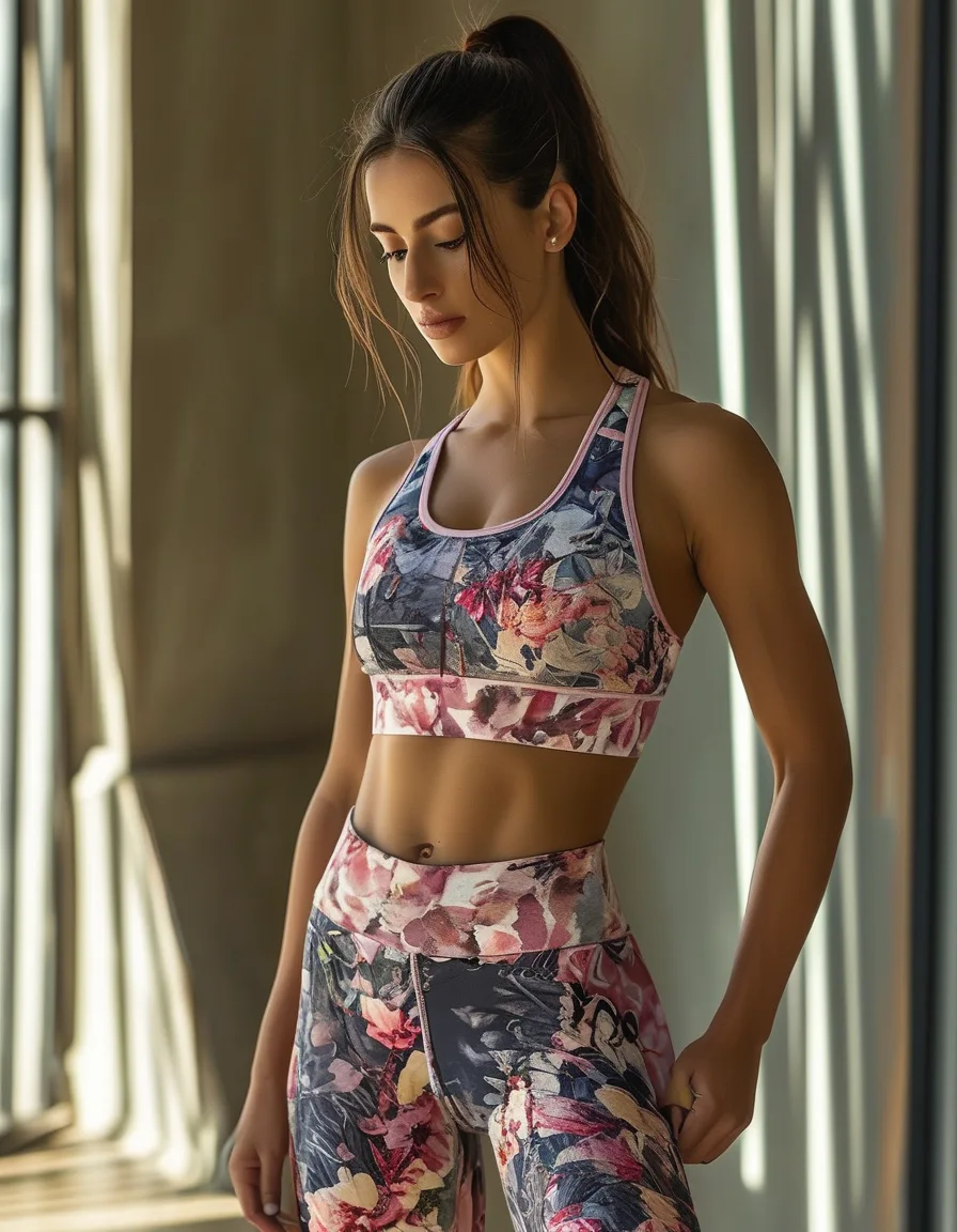
A pair of squat-proof high waist leggings in a matte, dense knit does more for the “expensive” read than anything else you could buy at the same price, because it fixes shine, thinness, and sag simultaneously.

How Should Athleisure Fit?
Skimming, not sagging, and not straining.
- Leggings: no waistband roll, no knee bagging, and full opacity when you bend. If they’ve stretched out, they’re gym-only now.
- Tops: either genuinely fitted or deliberately oversized with a defined shoulder line. The dead zone is “slightly too big by accident,” which is where most sloppiness lives.
- Joggers: a taper at the ankle. This one detail separates joggers that look considered from joggers that look like pyjamas.
- Length: hems that end somewhere intentional. Leggings at the ankle bone, sleeves at the wrist.
And the rule nobody wants to hear: the ratty set doesn’t leave the house. Keep worn-out pieces for actual workouts and cleaning. Wearing them out is the fastest route to the sloppy read regardless of everything else you do.
What’s the Single Highest-Impact Move?
Add one thing that isn’t athletic.
That’s the whole trick, and it works every time:
- A tailored wool coat over a hoodie and leggings
- A structured leather bag instead of a gym tote
- Clean leather sneakers instead of running shoes
- A proper knit instead of a sweatshirt
- Gold jewellery — hoops, a fine chain — over a plain crew neck
One non-athletic element reframes everything else as a deliberate outfit rather than clothes you happened to have on. A camel coat over black leggings and a black tee is the most reliable version of this in existence.
Why Does the Palette Matter So Much?
Because coordination reads as intention, and intention reads as expensive.
Stick to two or three colors, ideally neutrals — black, cream, grey, navy, olive, camel. Tonal dressing (multiple shades of one color) is even stronger and looks considerably more expensive than it is.
The mechanism is simple: a cohesive palette makes separate pieces look like they were bought together as an outfit. A mismatched one makes even good pieces look like a random selection from a drawer.
If you want color, put it in one place — a single knit, or a bag — and keep everything else neutral.
Mini FAQ
Can cheap athleisure look expensive?
Often, yes. Choose matte over shiny, dense over thin, and plain over branded, then keep the palette tight and add one non-athletic piece. Fabric quality is the main constraint, and mid-range brands frequently do dense matte fabric well.
Is athleisure appropriate for a casual office?
The elevated version usually is: a tailored coat, structured trousers or a matte legging, a real knit, and clean leather sneakers. Skip anything with visible sportswear branding, and avoid full technical fabrics head to toe.
What’s the difference between athleisure and just wearing gym clothes?
Intent and construction. Gym clothes are optimised for performance — moisture-wicking, high stretch, often shiny. Athleisure borrows the comfort but is designed to be seen: matte fabrics, cleaner lines, minimal branding.
TL;DR:
- Fabric first: thick, matte, opaque. Do the light test and the scrunch test before buying.
- Fit should skim — no rolled waistbands, no bagged knees, and taper your joggers.
- Add one non-athletic piece: a tailored coat, a real bag, clean leather sneakers, or gold jewellery.
- Keep the palette to two or three neutrals, or go tonal.
- The worn-out set stays home. Visible wear undoes every other decision you made.
Keep Reading
This article is for general styling and informational purposes only. Trends, sizing, availability and pricing may vary by brand and season.